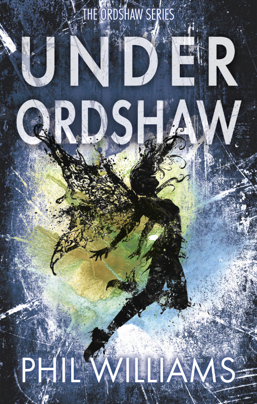
Under Ordshaw is almost upon us. I’ve just got through my final round of edits and am giving it one more read before shipping it off to the advance readers. That makes it a good time to show you something else I’ve been working on: the book’s cover.
In case you’ve missed any of my earlier updates about it, and are wondering exactly what Under Ordshaw is, let the cover do the talking:
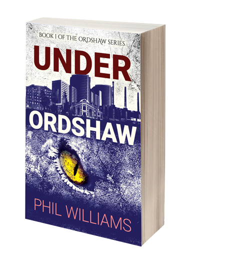
It’s a bit of a departure from your usual urban fantasy fare – but then, so is Ordshaw. Under Ordshaw is a thriller with a dose of horror and a dash of dark humour. Set in a gritty city with an awful lot going on, this novel follows a loner card sharp’s discovery of Ordshaw’s worst secrets. It’s the first in a three-part story – which in turn kicks off a long and crazy ride through this universe.
The cover was one of two choices I ended up with – and I’ve gone with the less literal of the two. Leaving a little more mystery about the sort of monster we’re dealing with. And this is a book that’s not light on mystery. If you like the feel of the imagery, you’ll like what’s coming.
(And if you want a bonus cover update, I’ve used the same style for my short story The Wrong Way, which uses Ordshaw as a backdrop to a standalone vignette. Check it out here.)

